
Re-branding a University identity design for GSCST (Gratuate School of Convergence Science and Technology) at Seoul National University
Aiming to create a new type of knowledge that surpasses barriers between existing disciplines, GSCST has established four programs in the Department of Transdisciplinary Studies:
- Nanoscience and Technology
- Digital Contents and Information Studies
- Intelligent Systems
- Biomedical Radiation Sciences
Client
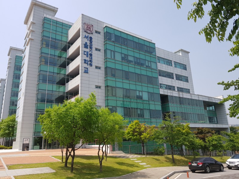
Seoul National University (Graduate School of Convergence Science and Technology)
Role
Designer
Deliverables
Brand Identity
Brand Guidelines
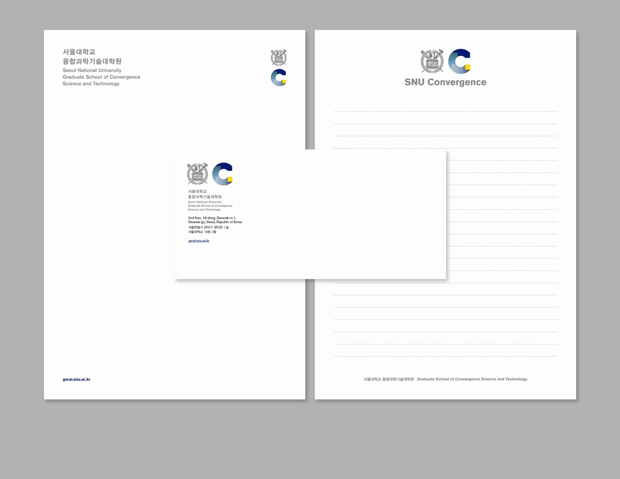
Print and Digital Applications
Tools
InDesign
Illustrator
Photoshop
Team
Creative Direction: Kyungsun Kymn
Designer: Celine Han
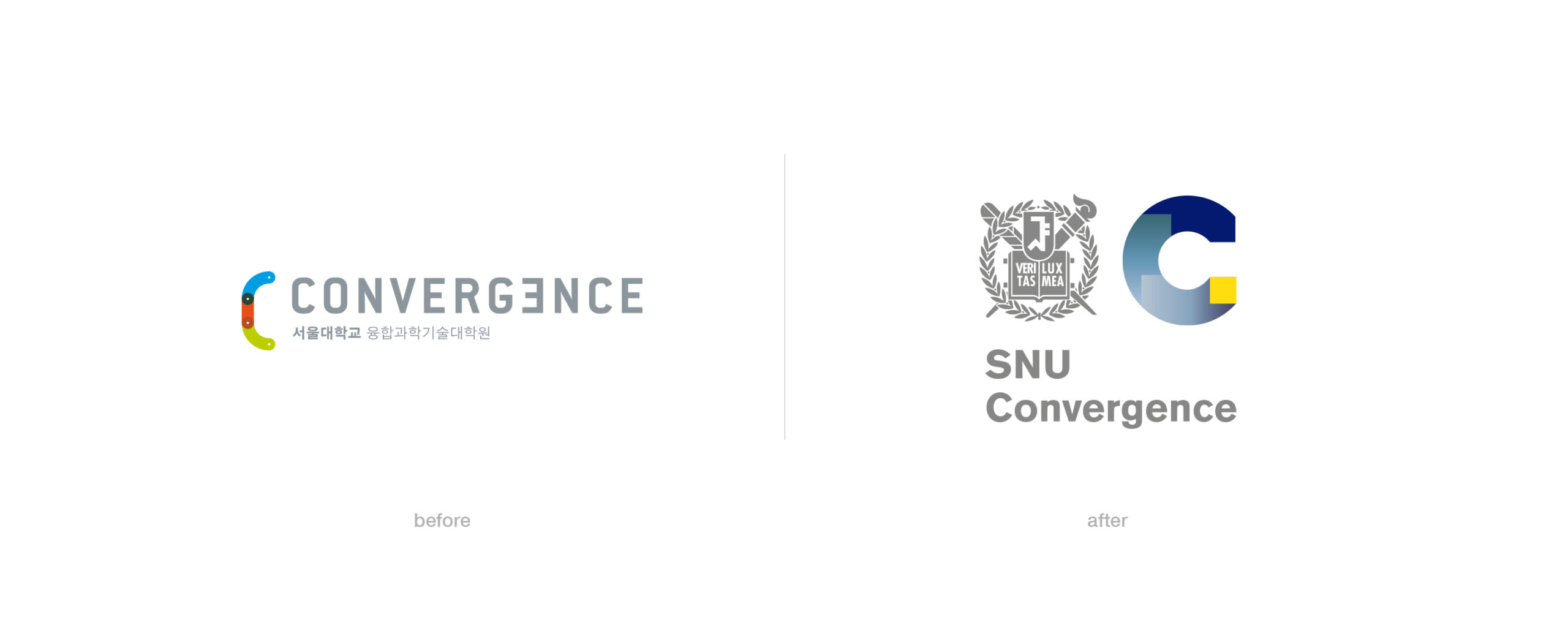
Problem
The concept of ‘convergence science’ is difficult to visualize. The pre-existing logo and brand did not represent what they do well, and did not covey a new and futuristic look and feel it strived to get across. It also did not tie in well with the Seoul National University brand.
Approach
We tried to come up with a more modern look and convey the concept of Convergence in a fresh and memorable way. We did this while trying to make sure that the new logo and colors work well with the Seoul National University’s look and feel, for consistency of the overall University brand.
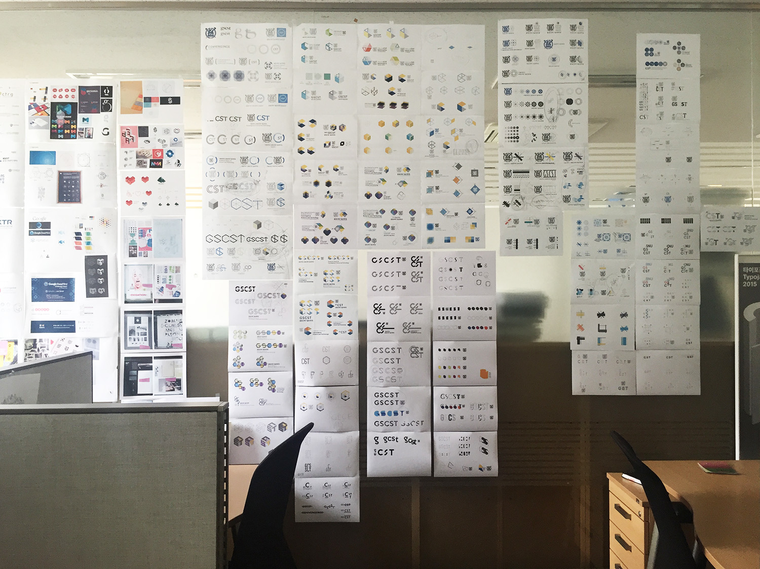
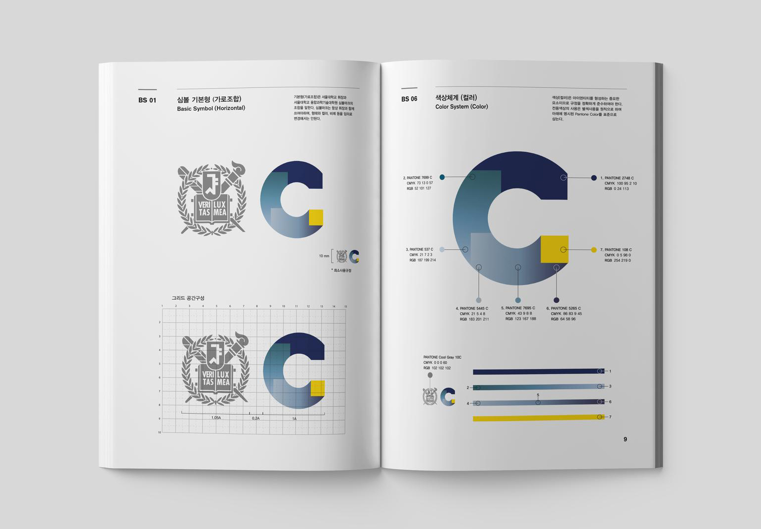
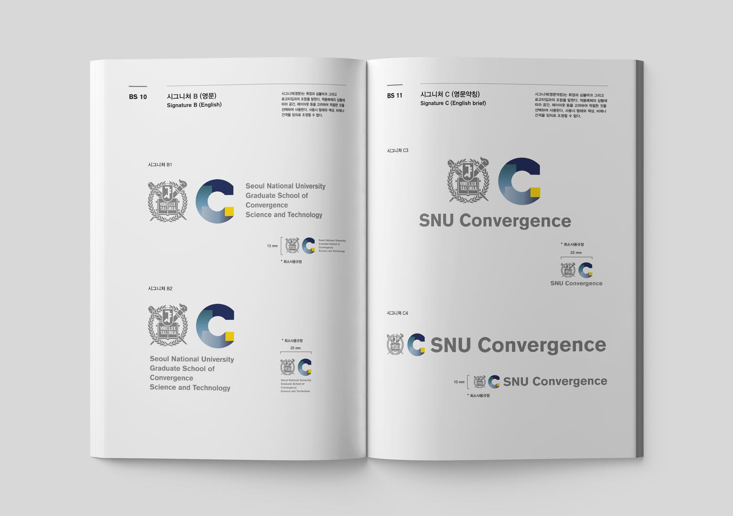
Solution
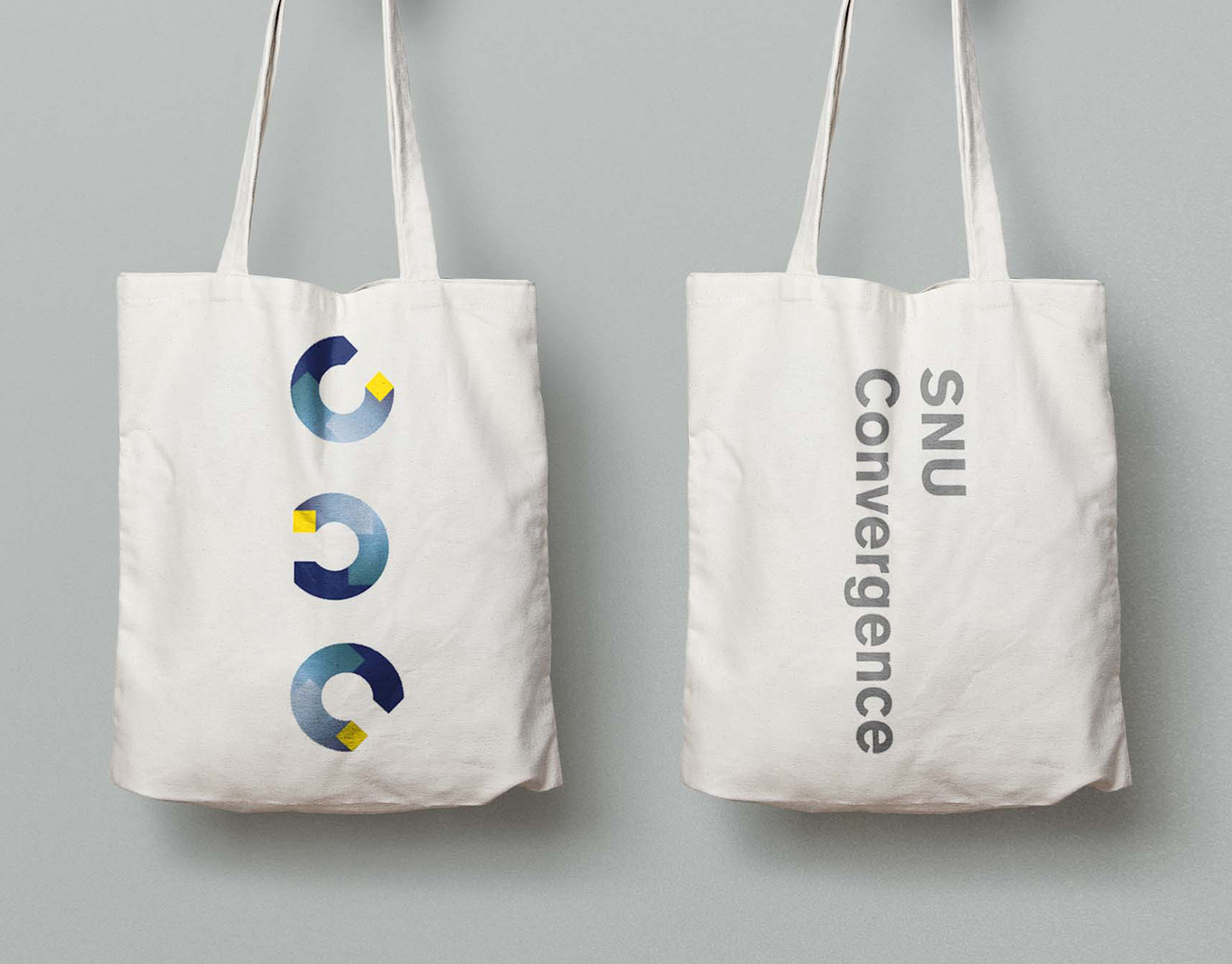
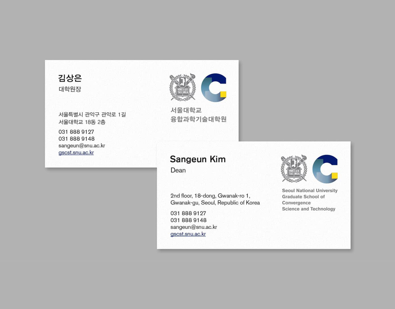
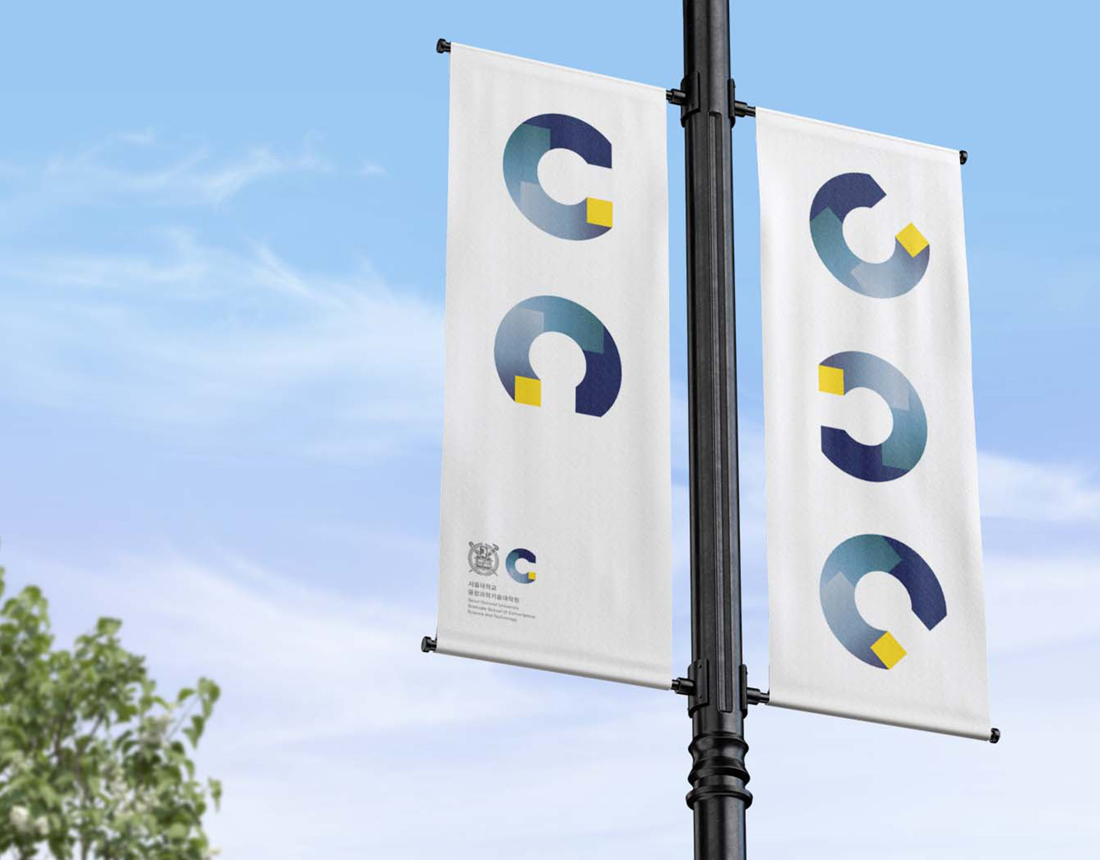
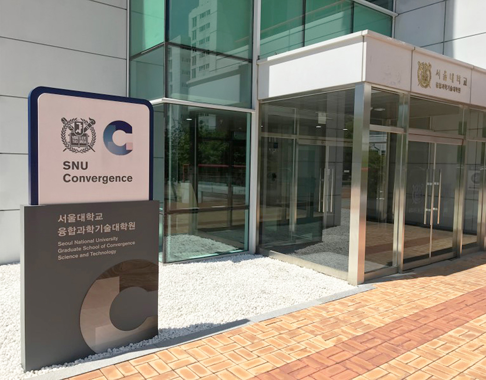
The main visual symbol is in a shape of the alphabet C, as short for 'Convergence'. The yellow square is the starting point in which the shape is formed by it moving clockwise, signifies sustainability. The color system is derived from a spectrum formed by four main colors: indigo, turquoise, purple and yellow, symbolizing SNU, Creativity, Sustainability and Innovation respectively.