
Typojanchi 2015:
The 4th International Typography Biennale, C( )T( )
Projects highlighted below:
- Wayfinding System
- Comedy Carpet Collaboration
- Typojanchi Report (Publication)
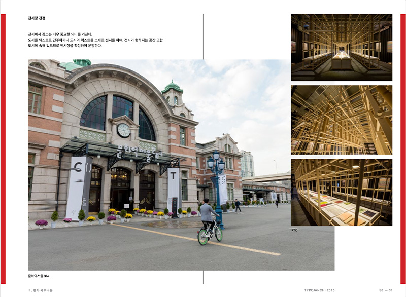
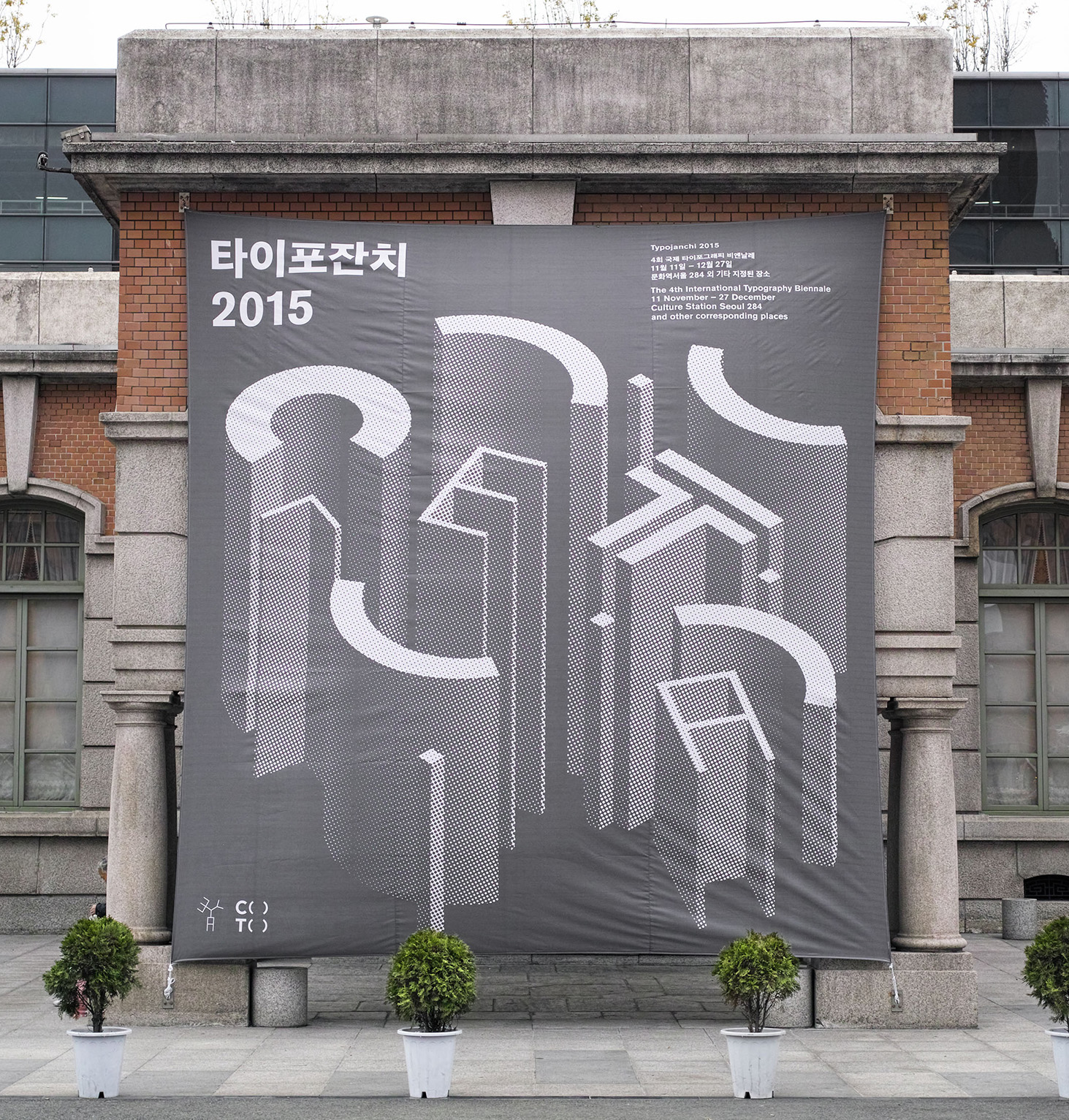
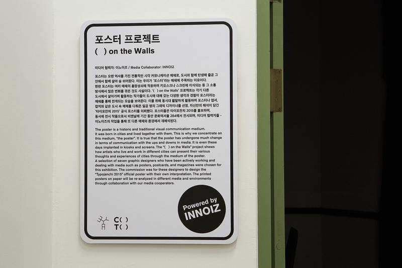
The 2015 international Biennale, dedicated solely to Typography, took place from November 11th to December 27th in the historic Culture Station Seoul building. It gathered 90 teams of artists and designers worldwide to celebrate the art of typography.
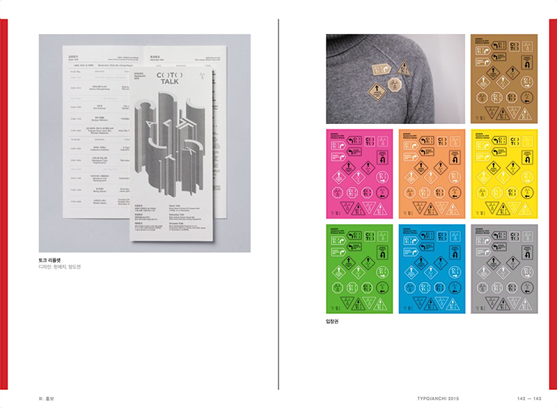
Typojanchi 2015 revolved around the theme of City and Typography, embodied by its identity, C( )T( ). This concept, pronounced as 'CITY' without the vowels, emphasized the significance of 'in-between spaces' in defining a city's personality, character, and vitality. The exhibition uniquely explored intersections where visible language intersects with literature, music, film, politics, and economy, inviting participants to celebrate these defining spaces with typography during this janchi, meaning 'Party' or 'Celebration'.
Client
Hosted by:
Ministry of Culture, Sports and Tourism
Supervised jointly by:
Korea Craft & Design Foundation, organization committee of international typography biennale
Role
Graphic Design (Lead)
Exhibition Coordinator
Deliverables
Editorial design
Long-formatpublication design
Environment/exhibition design Wayfinding system
Collaborative, typographical artwork for exhibition
Production and curation of artwork
Tools
InDesign
Illustrator
Photoshop
Team
Director: Kymn Kyungsun
Special Exhibition Director: Adrian Shaughnessy
Chief Curator: Lee Kiseob, Lee Jaemin, Chris Ro, Kelly Choi Moonkyung
Curator: Tetsuya Goto, Min Byunggeol, Fritz K. Park, Ahn Byunghak, Cho Hyun (Shim Daeki, Lee Choongho)
Committee: Jun Miyeon, Lee Hongkyu, Adele Yoon Hyunjung
Coordinator: Sohn Youngeun, Lee Da Eun, Asechi Kimi, Jiang Yan
Exhibition Identity : Studio fnt
Exhibition Space Design: Zero-lab
Graphic Design: Sohn Youngeun, Kang Hong, Lee Da Eun
Design Assistant: Yang Doyeon, Han Yeji, Leem Hyeeun, Kim Sohee
Website Design: E Roon Kang
Official Poster Design: Aaron Nieh, Helmo, Lee Jaemin, Ludovic Balland, Keetra Dean Dixon, Richard Niessen, Siggi Eggertsson
Communication Poster Design: Lee Jaemin
Catalogue Publishing: Ahn graphics
Catalogue Editing: Park Hwalsung
Catalogue Design: Lee Kyeongsoo
Photography: SSSauna studio
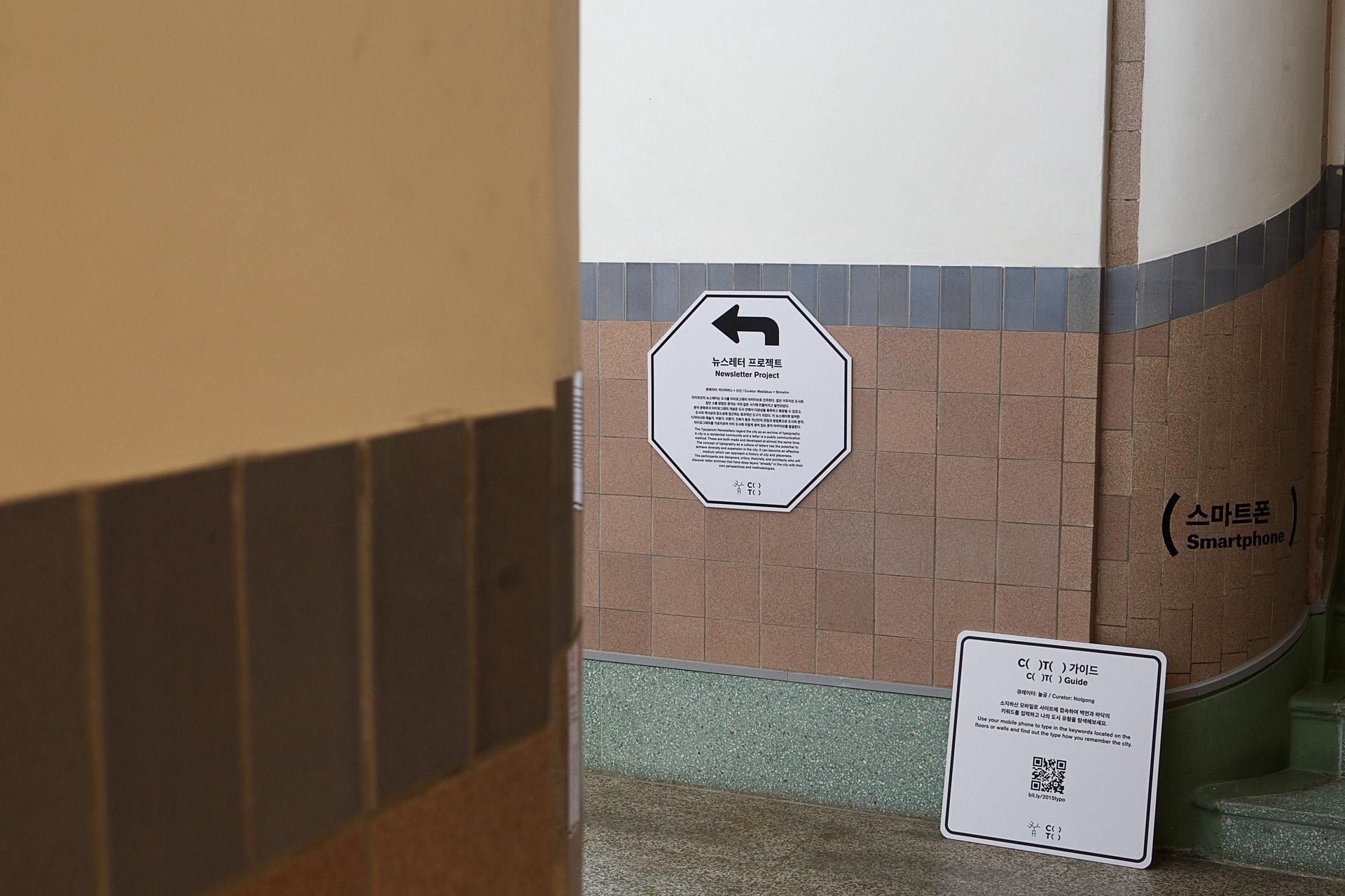
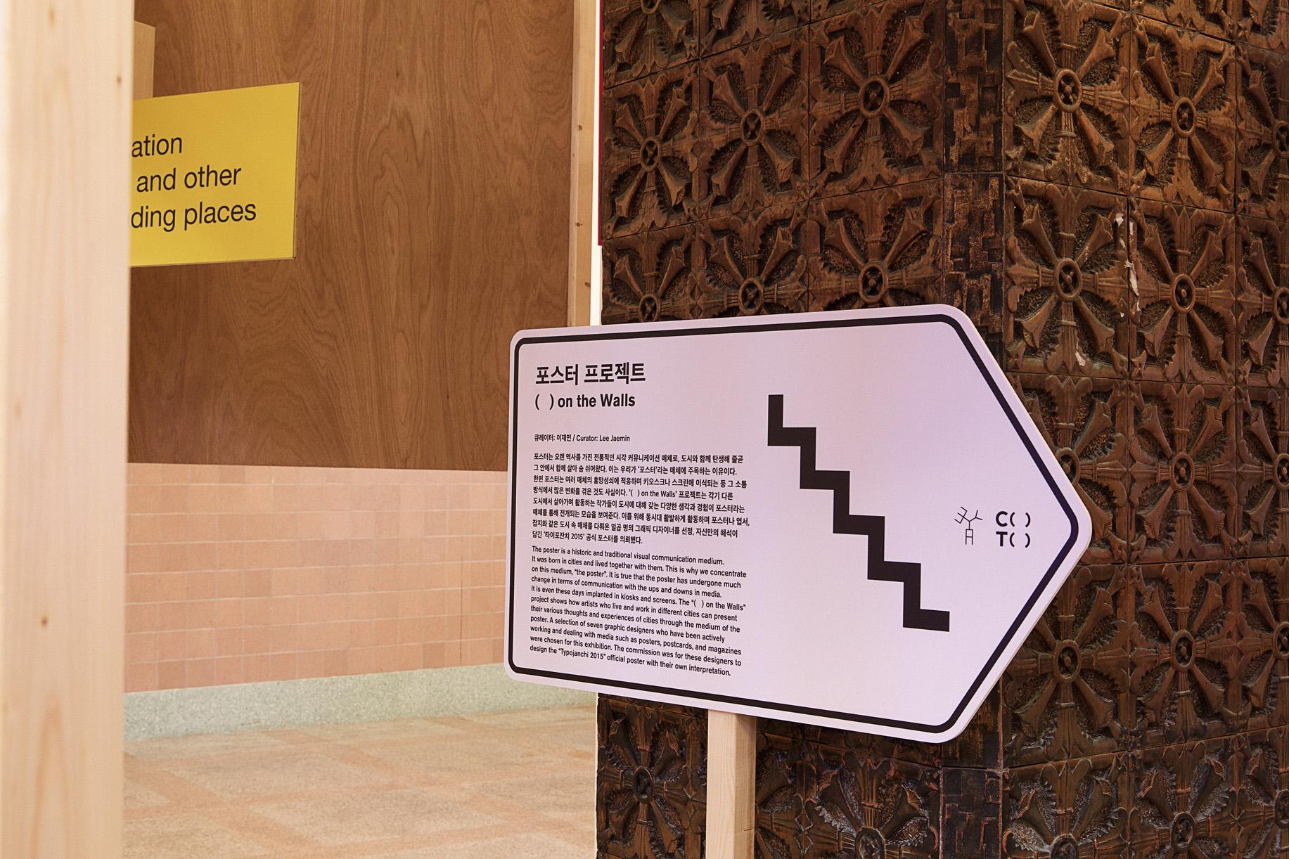
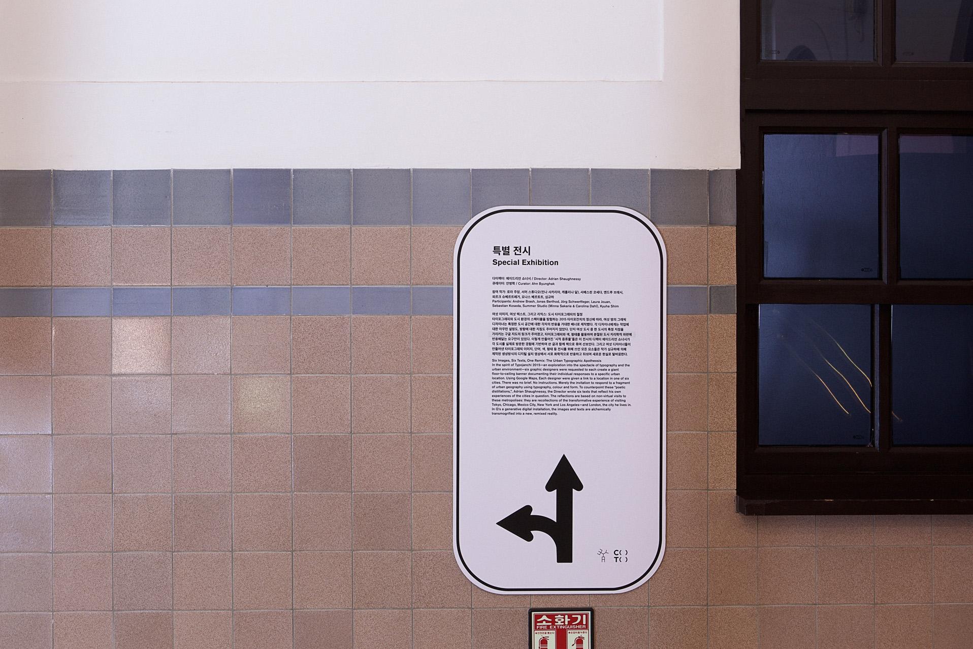
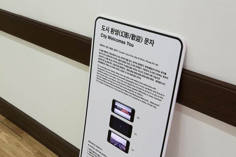
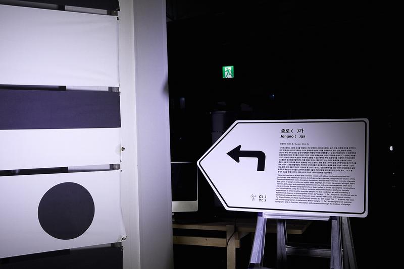
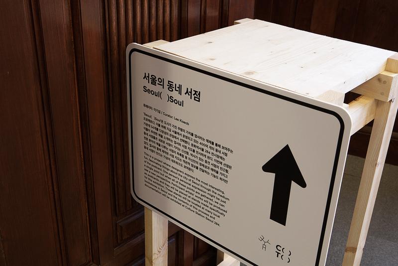
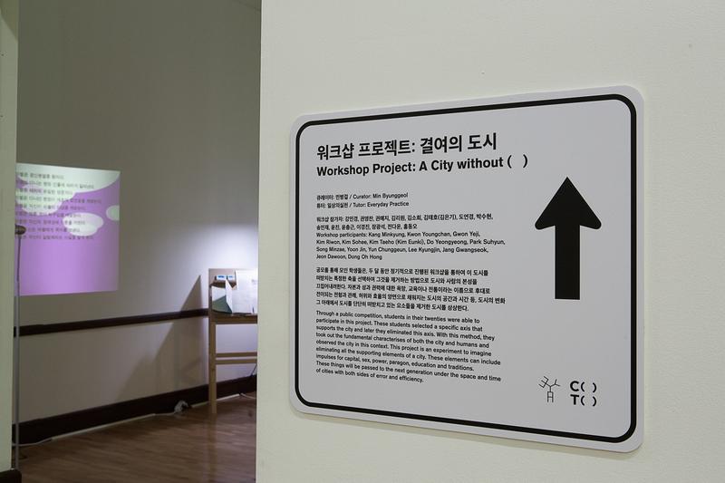
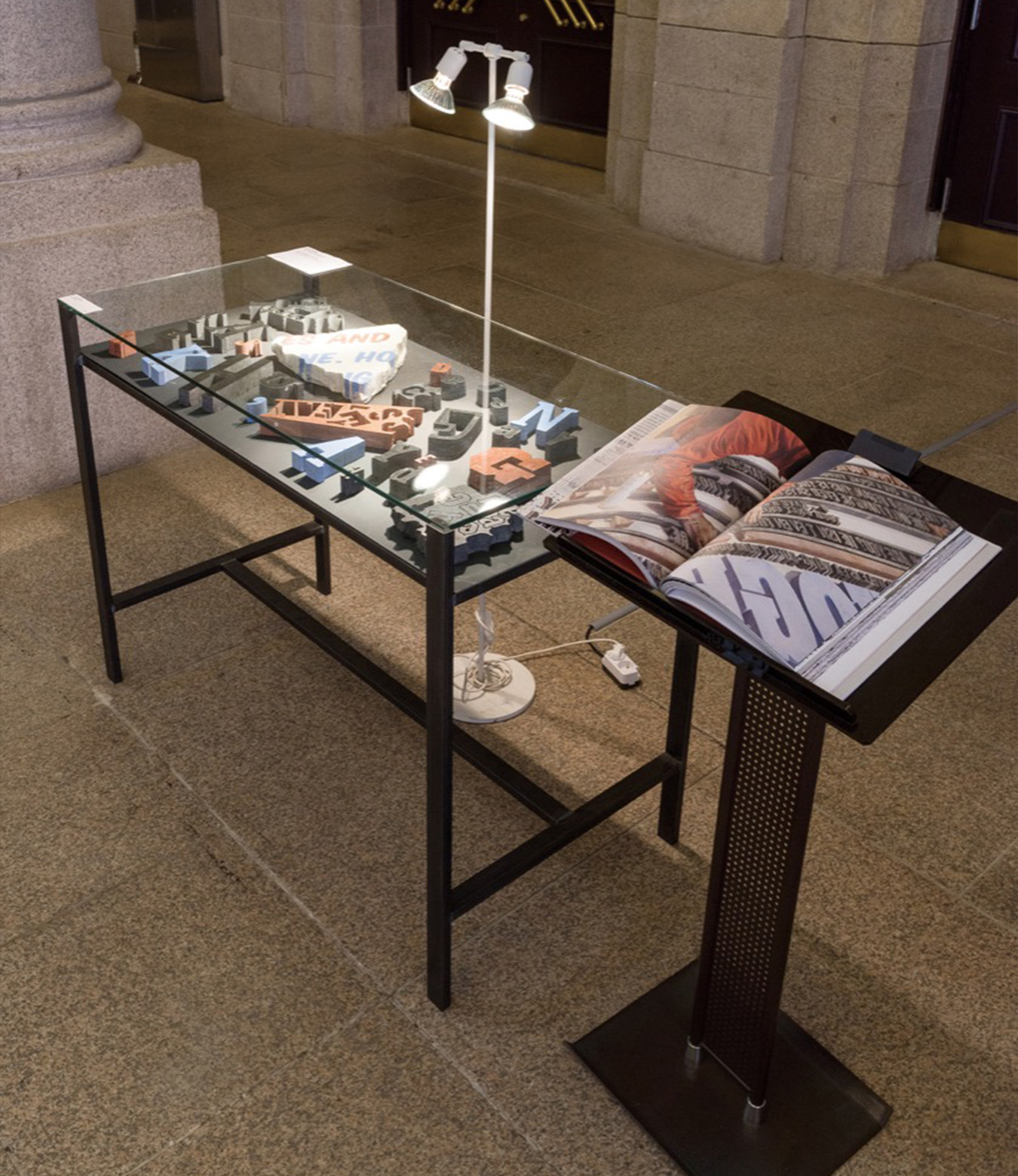
Wayfinding System
Since the exhibition was held under the theme of ‘City and Typography’, the exhibition signs were designed as if the entire exhibition space itself was a city. Inspired by road signs, they were placed in front, or with, each of the corresponding exhibition areas, with explanations of that space. I was the lead designer for these signage designs and led other designers.

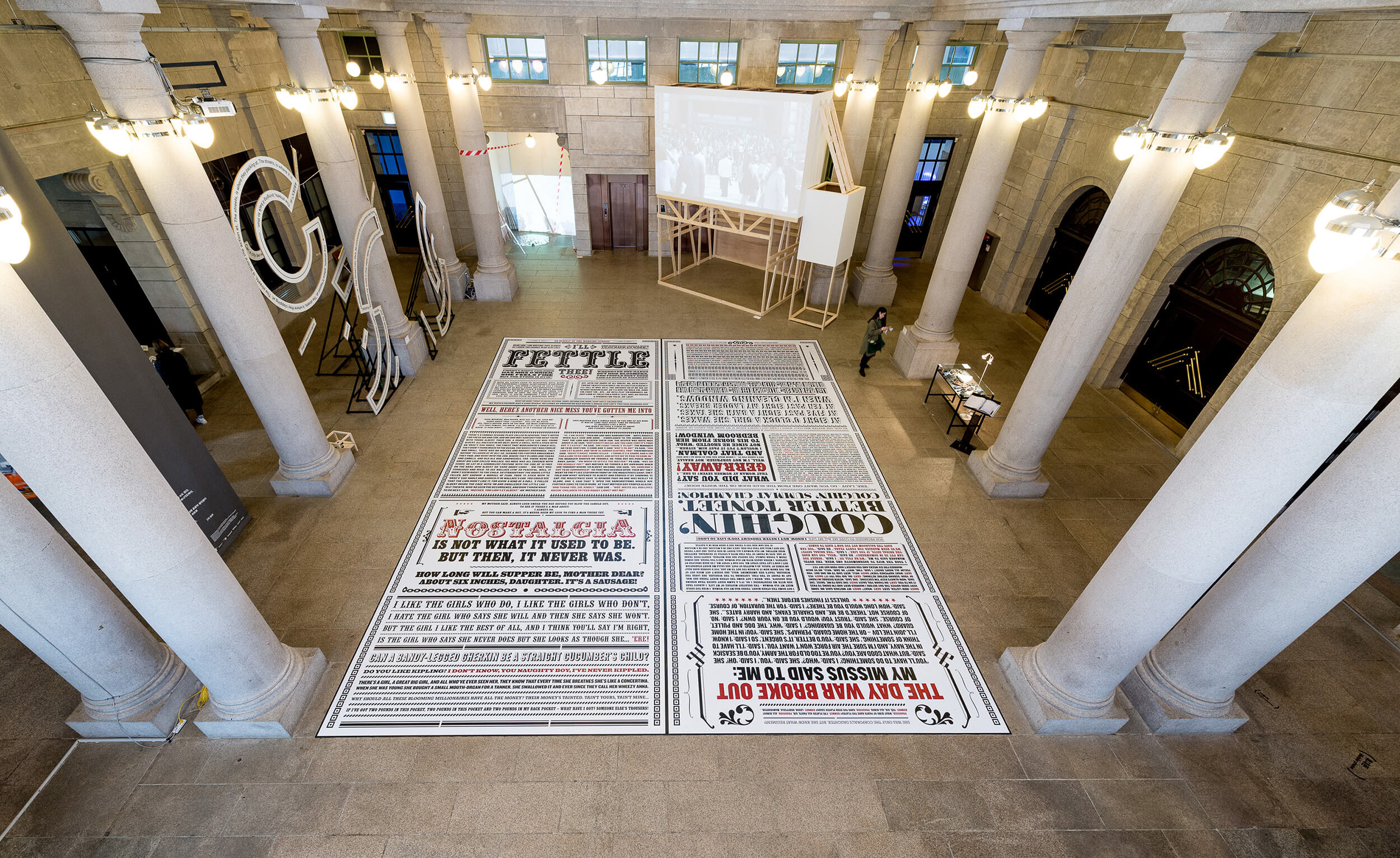
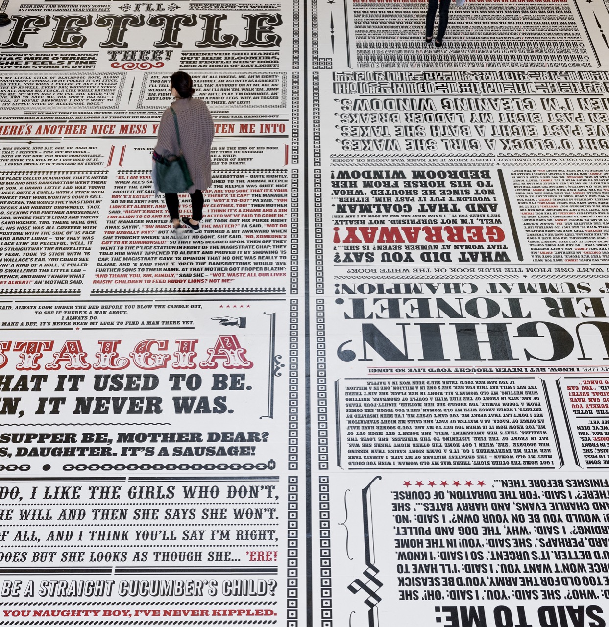
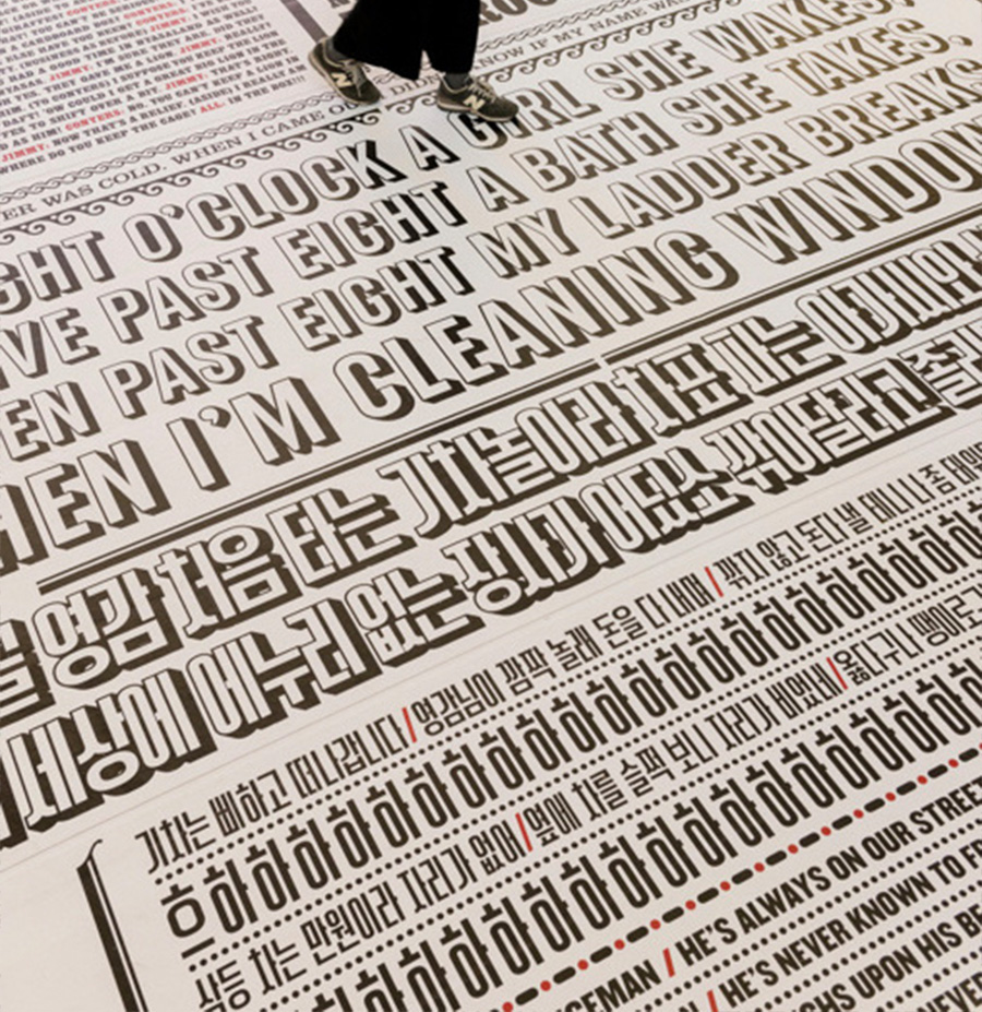
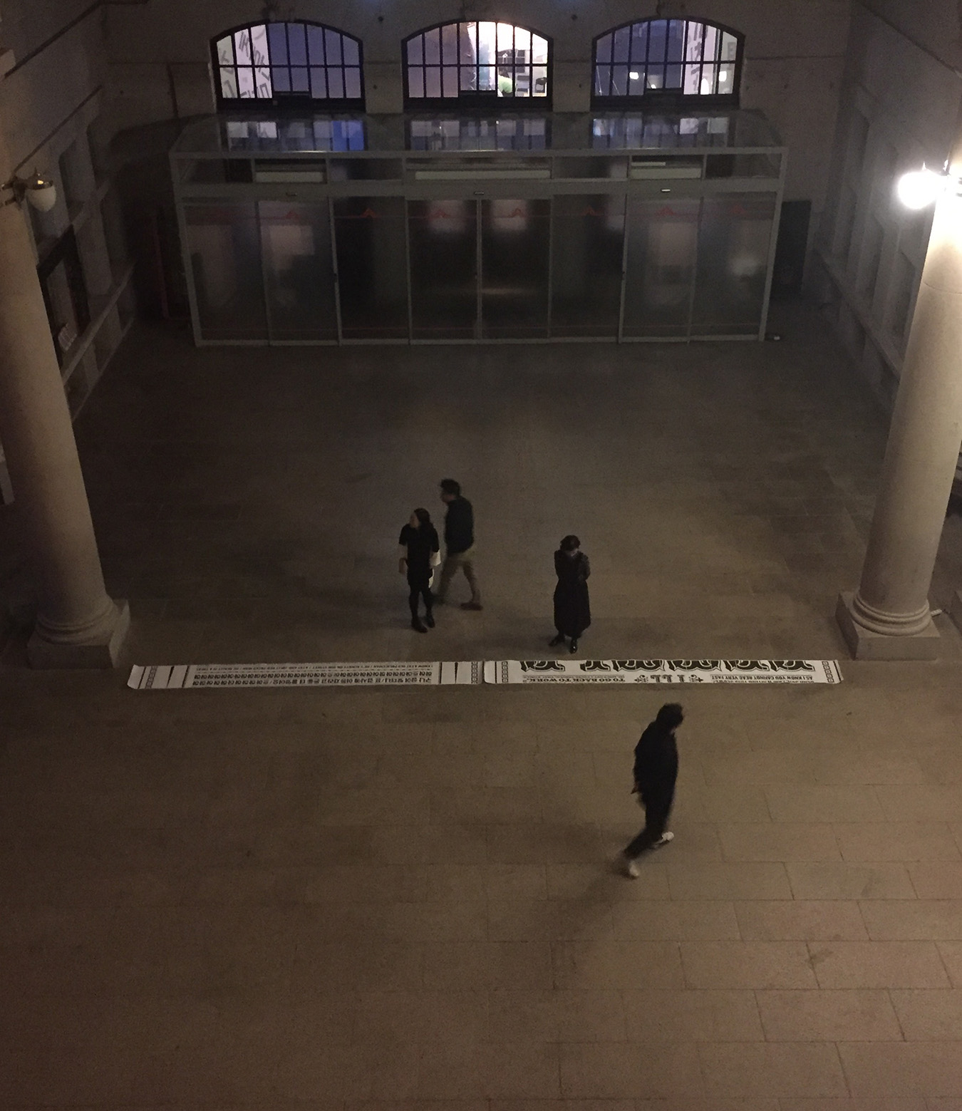
Comedy Carpet
Collaborated with Why Not Associates on a typographic project, integrating Korean type into the renowned Comedy Carpet in Blackpool, England. A segment of this extensive 2200m² artwork featured in the Typojanchi exhibition sparked a collaboration led by Andy Altmann. We printed a digital section onto our exhibition floor, seamlessly incorporating a Korean comedy addition into their design. Managing this project encompassed liaising with the artist, researching a fitting Korean comedy insert, and researching and integrating the right Korean typeface into the carpet design to harmoniously blend with the original art.


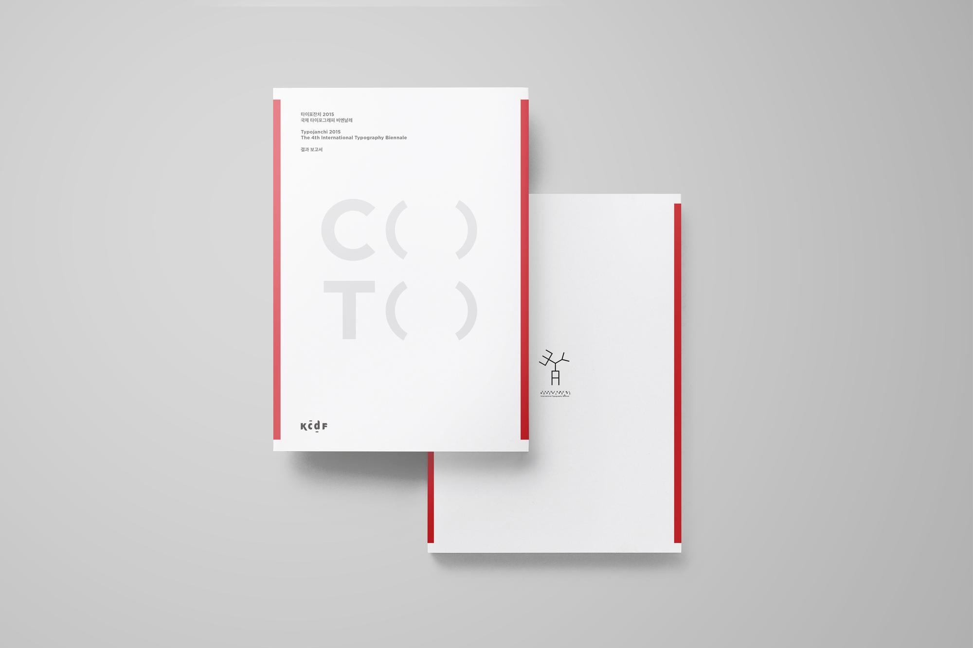
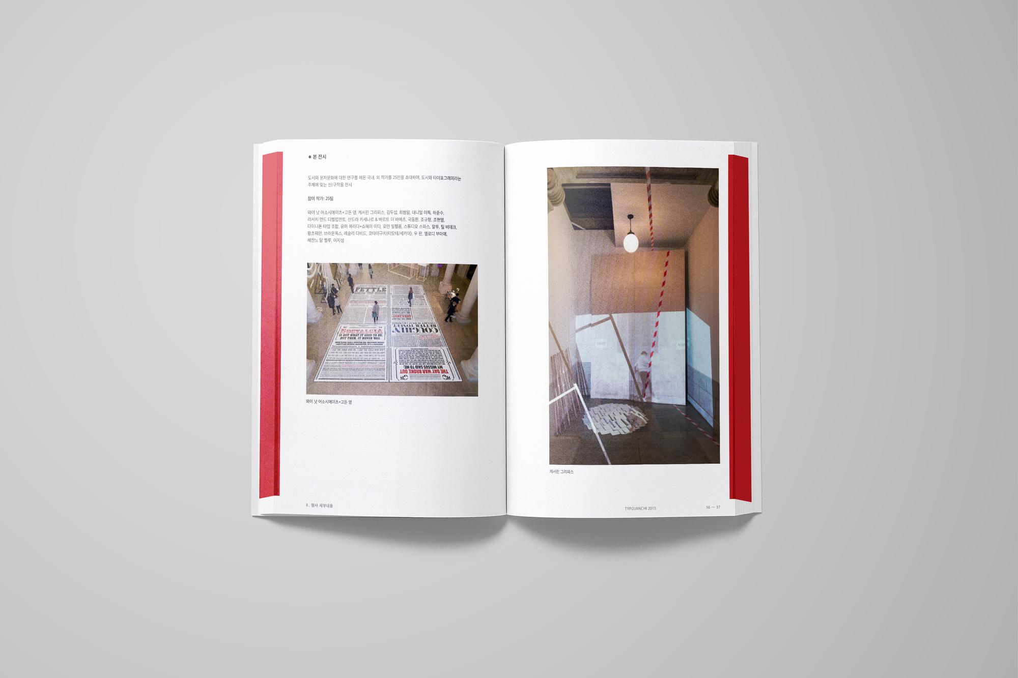
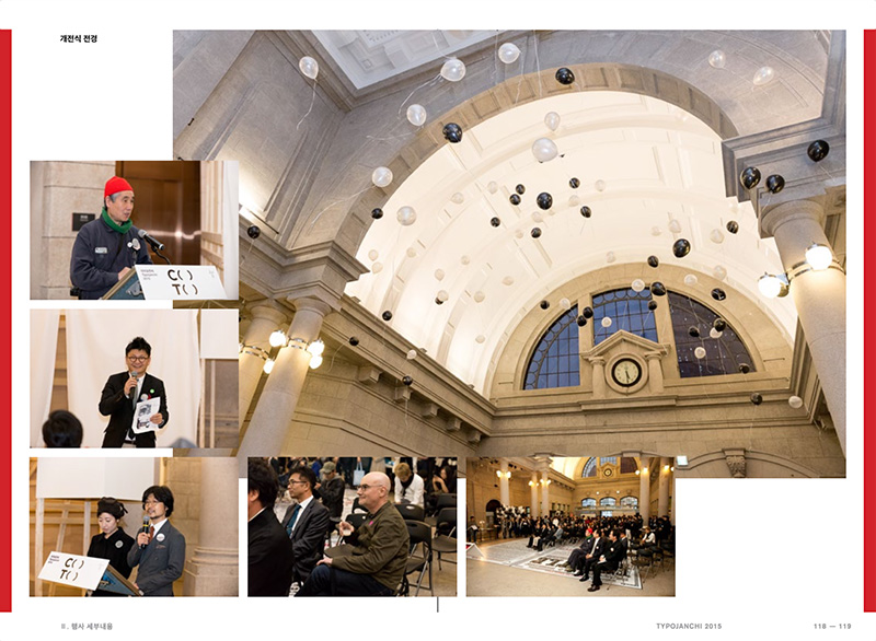
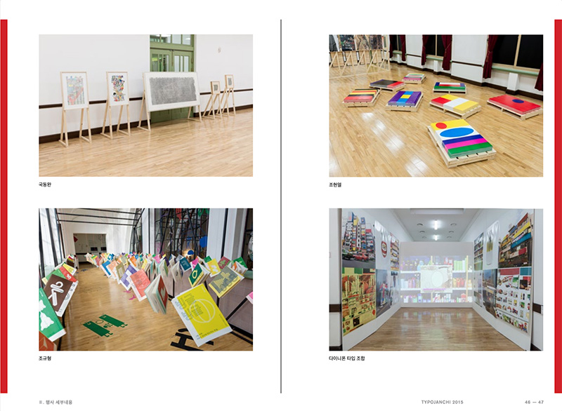
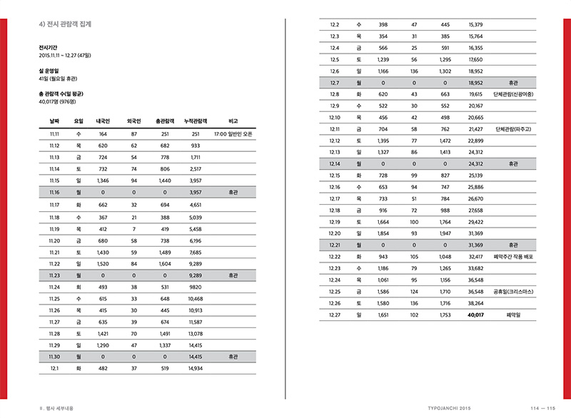
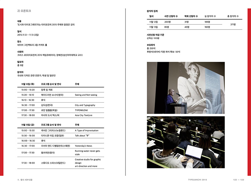
Typojanchi 2015 Report
This publication serves as an archival record of the event. I was the sole designer who took charge in the entire process from gathering information, content editing, and layout creation for the book, overseeing its journey from conceptualization to production. Notably, the red bars on the spread edges that are extending beyond the pages symbolize the parentheses concept of the exhibition identity, C( )T( ). Spanning 230 pages, this book encapsulates the essence of the event.